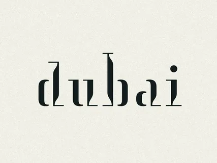
A logo may be only a small visual element, but it often becomes one of the first things people associate with a business. For companies operating in Dubai, that first impression can be particularly important. The city brings together local businesses, international companies, startups, luxury brands, and customers from many different cultural backgrounds.
Creating an effective logo design in Dubai therefore involves more than choosing an attractive symbol and typeface. A useful logo should communicate the character of the business, remain recognizable at different sizes, and work consistently across both digital and physical applications.
Start With the Business, Not the Artwork
One common mistake is beginning the design process by choosing colors, icons, or fonts before defining what the brand needs to communicate.
Before developing concepts, consider:
- What does the company offer?
- Who are its primary customers?
- What qualities should people associate with the business?
- Where will the logo appear most often?
- Does the company want to appear traditional, modern, premium, approachable, or innovative?
For example, a financial consultancy may need a visual identity that communicates reliability and professionalism, while a children’s activity center could benefit from a warmer and more playful approach.
The objective is not to make a logo that looks impressive in isolation. It should make sense in relation to the business behind it.
Consider Dubai’s Diverse Audience
Dubai’s business environment is unusually international. A brand may communicate with customers who have very different cultural references and expectations.
This makes simplicity valuable. A complicated symbol may look interesting during a presentation but become difficult to understand when viewed quickly on a mobile screen, storefront, social profile, or business card.
Businesses should also consider how symbols, colors, and written language may be interpreted by different audiences. If a company serves both Arabic- and English-speaking customers, the visual identity should accommodate bilingual applications without making either version feel like an afterthought.
This is especially important when the logo will appear alongside Arabic and English business names.
Design for Real-World Use
A logo should be tested in the environments where customers will actually encounter it.
At minimum, consider how the design performs on:
- Websites and mobile screens – Small details can disappear on smaller displays.
- Social media profiles – Many platforms use circular or square image areas.
- Signage – Distance, lighting, and production materials can affect readability.
- Printed materials – A design that works digitally may require adjustments for print.
- Packaging and merchandise – Embroidery, engraving, and printing may require simplified versions.
A strong identity normally includes practical variations, such as a primary logo, a compact version, and a monochrome treatment. This gives a business flexibility without changing its recognizable identity from one application to another.
Don’t Ignore the Website
A logo rarely operates independently. It forms part of a wider customer experience that includes the website, typography, colors, imagery, and user interface.
When a company is developing or redesigning its website at the same time as its visual identity, coordinating the two projects can produce a more consistent result. Businesses exploring the technical side of a tailored website can also learn more about custom web development and how a website can be built around specific business requirements.
The key is consistency. The logo, website, social profiles, documents, and physical materials should look as though they belong to the same organization.
Questions to Ask Before Approving a Logo
Before finalizing a design, ask a few practical questions:
Is it recognizable without an explanation?
If viewers need a lengthy explanation to understand the basic idea, the concept may be too complicated.
Does it still work when made very small?
A logo should remain identifiable as a social-media icon or mobile header element.
Will it remain useful in several years?
Following every short-lived design trend can make an identity age quickly.
Can it work in black and white?
If the design depends entirely on color, some applications may become difficult.
Can it be used consistently?
The final files should support different digital and print requirements rather than forcing the business to recreate the logo for every use.
Final Thoughts
An effective business logo is not simply an attractive graphic. It is a practical identity system that needs to communicate clearly across different audiences, languages, platforms, and physical environments.
For Dubai businesses, understanding the audience and planning for real-world applications can be just as important as the visual concept itself. A thoughtful process—starting with business goals, testing different applications, and building consistency across the wider brand—can produce an identity that remains useful long after the initial launch.